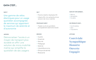
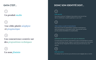
Gaya
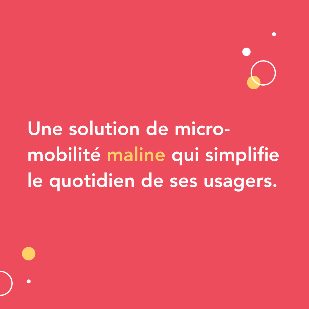
Gaya is a friendly, accessible, open, smart and committed brand of electric bikes! Far from its impersonal and ultra-technical competitors, Gaya opens the way to soft and sustainable mobility by adapting to all users, whatever their journeys, their luggage or their passengers.
Sprint 01
Ideation and design of the logo, the brand expression, the graphic charter and the illustrations
Sprint 02
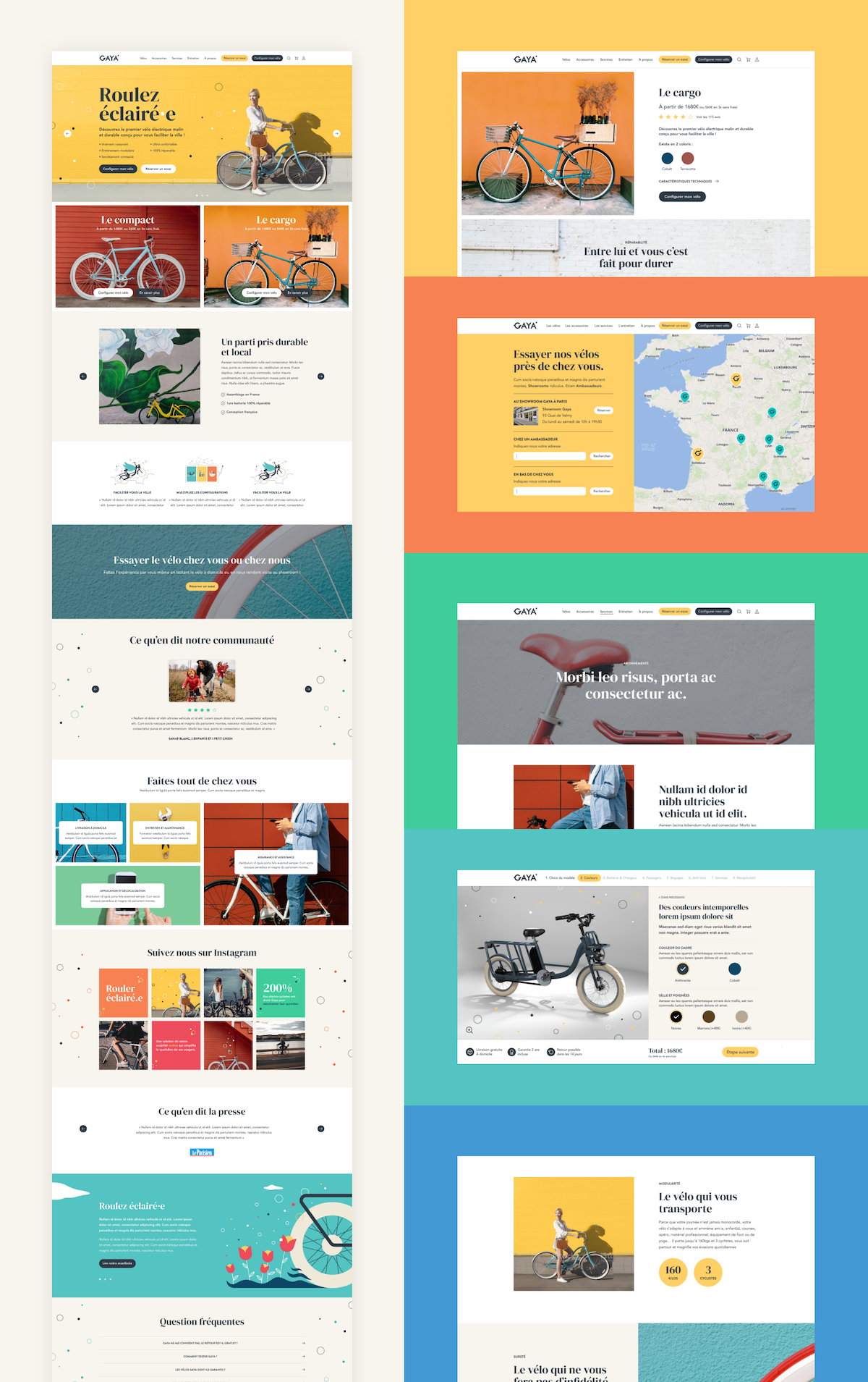
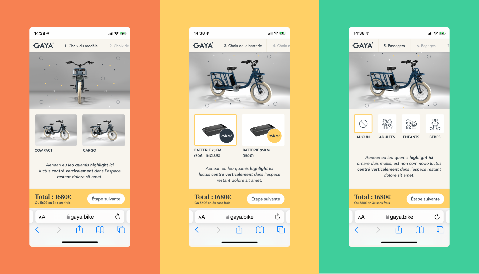
Ideation and design of the UX and UI of the e-commerce site and the bike configurator
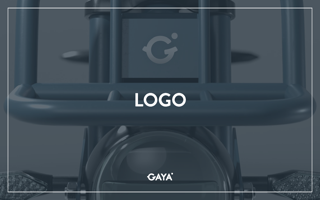
Branding
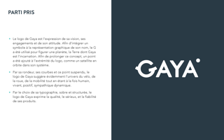
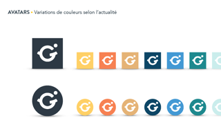
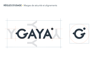
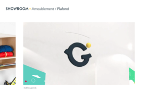
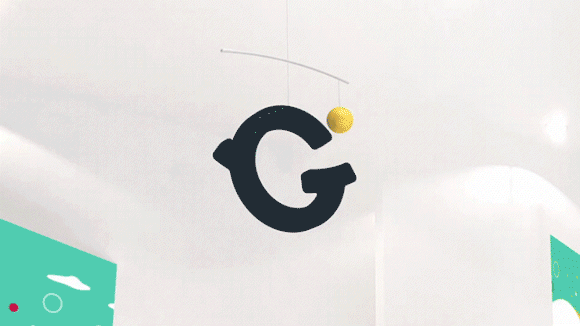
The Gaya logo is the expression of its vision, its commitments and its attitude. The G was used to represent a planet, the Earth of which Gaya is the incarnation. To extend this concept, a dot has been added to the end of the logo, like a satellite orbiting in its ecosystem. By its roundness, its curves and this suspended point, the logo obviously suggests the universe of the bicycle, the wheel, the mobility, while being human, alive, positive, sympathetic and dynamic.
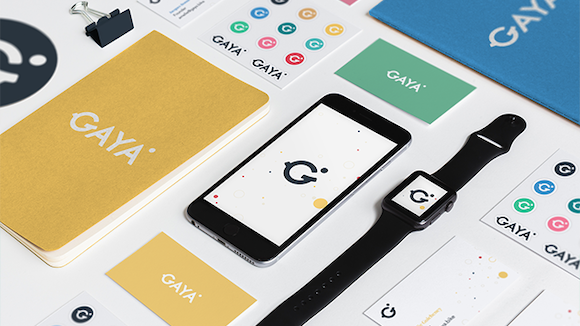
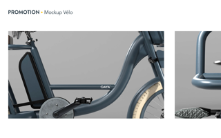
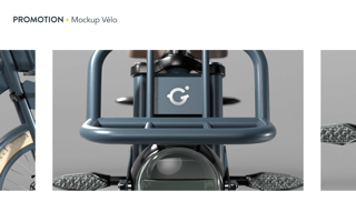
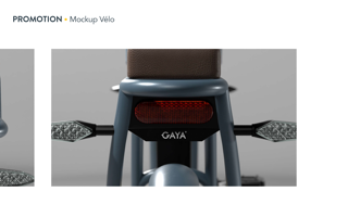
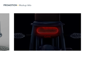
Product branding
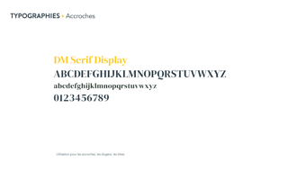
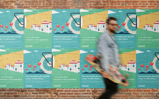
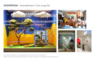
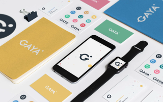
Display
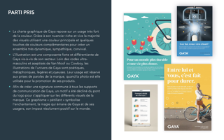
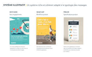
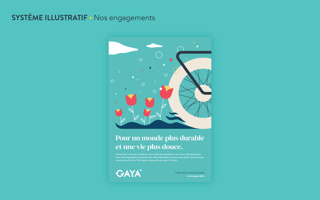
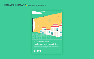
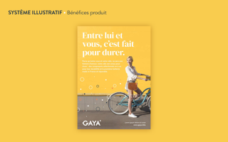
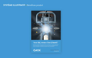
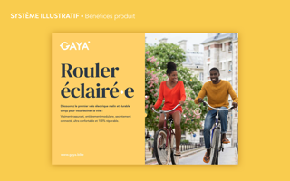
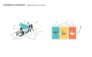
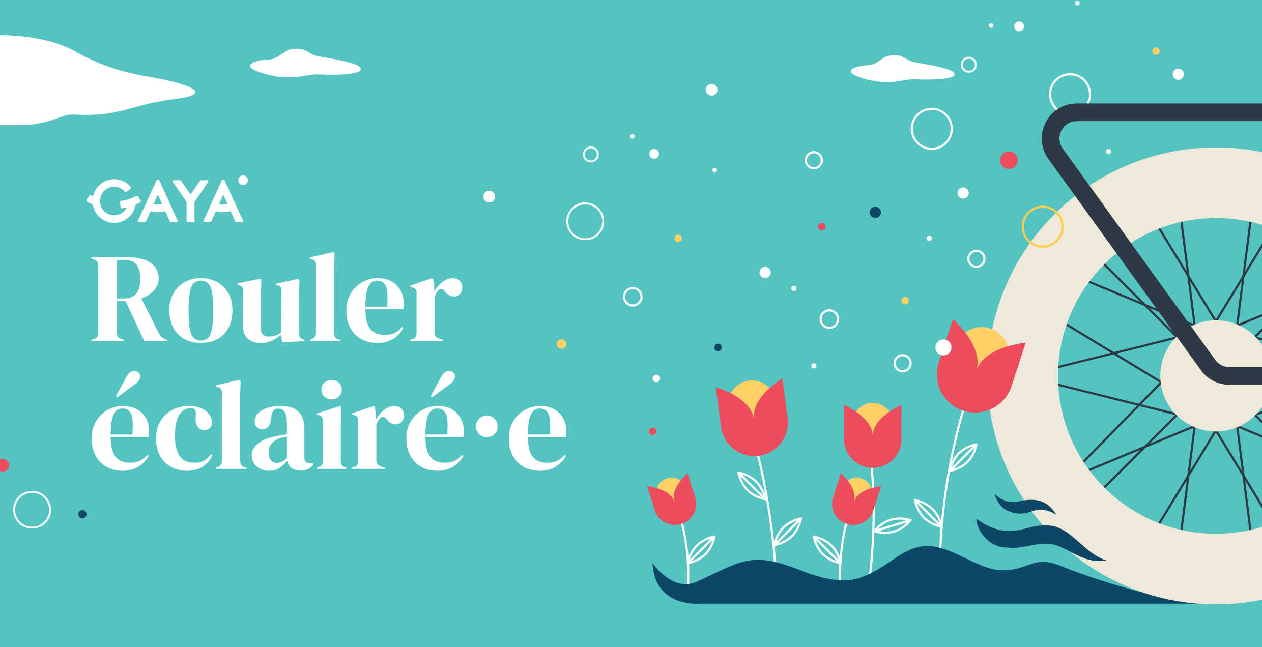
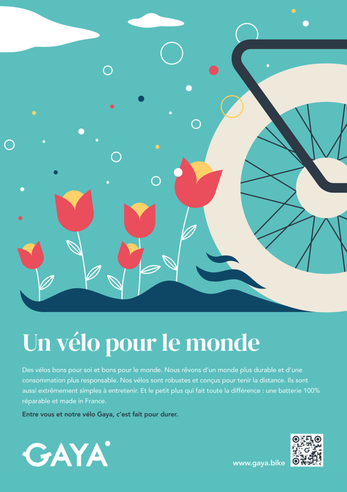
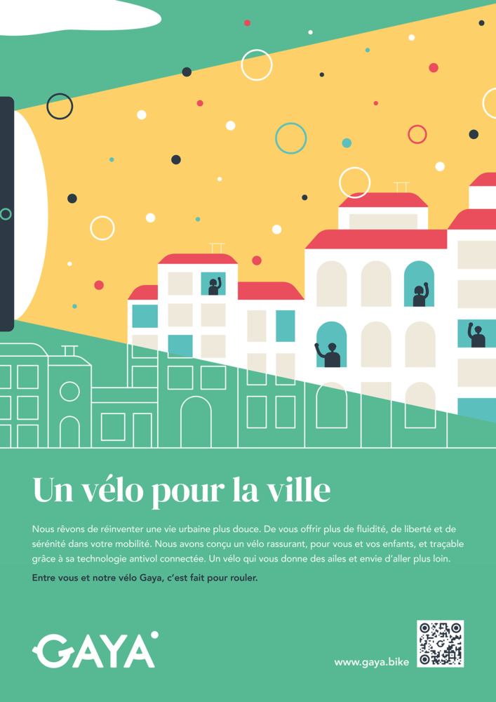
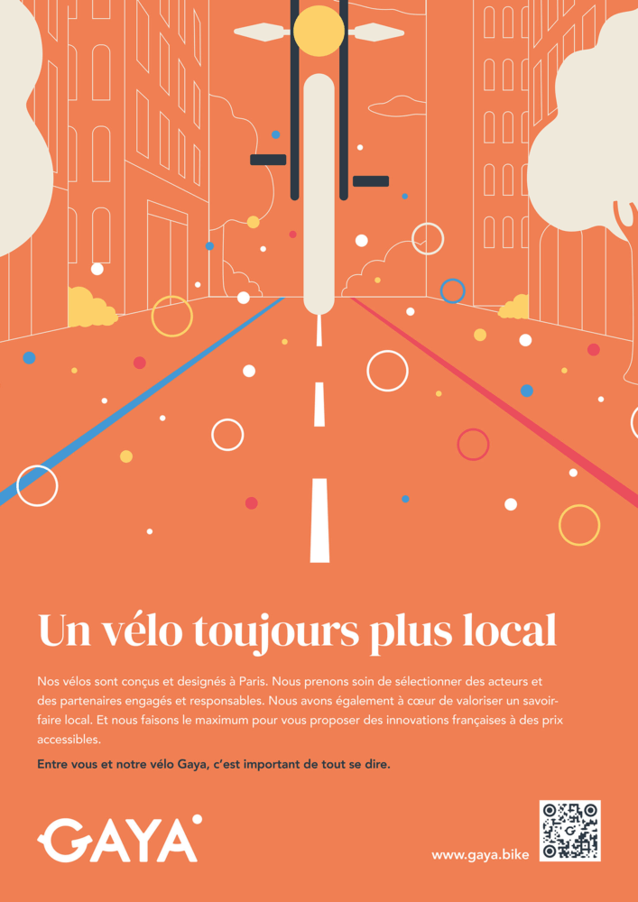
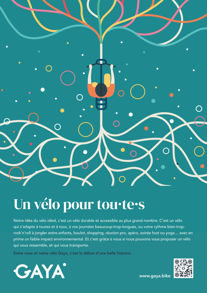
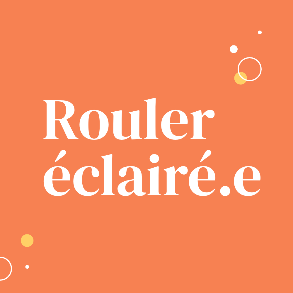
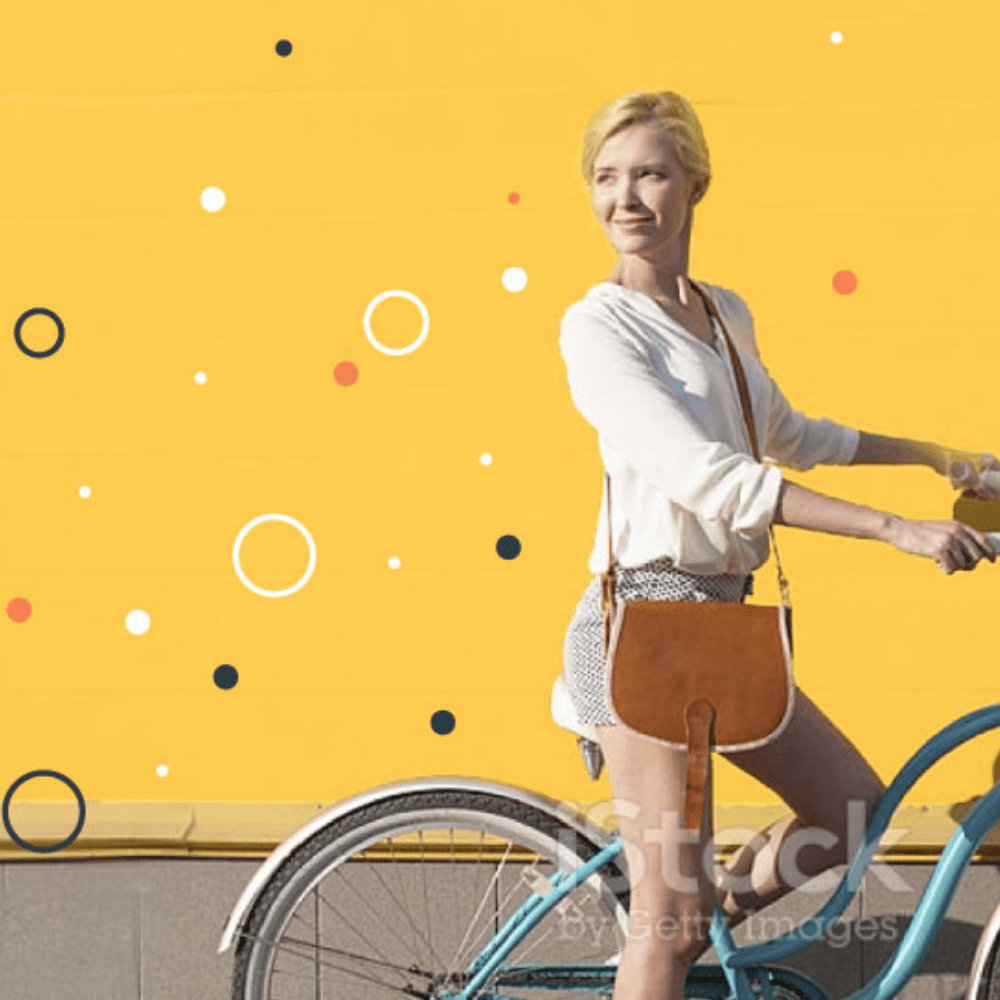
Illustration is a strong and differentiating component of Gaya vis-à-vis its sector. Far from ultra-masculine and sanitized codes from its competition, the illustrations of Gaya's universe are poetic, metaphorical, subtil and joyful.
UX/UI
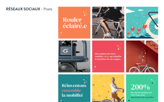
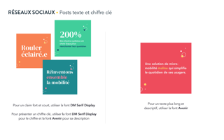
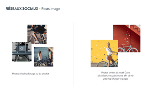
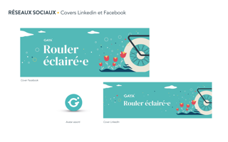
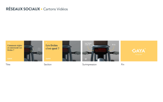
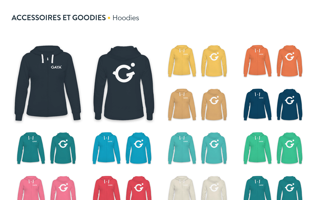
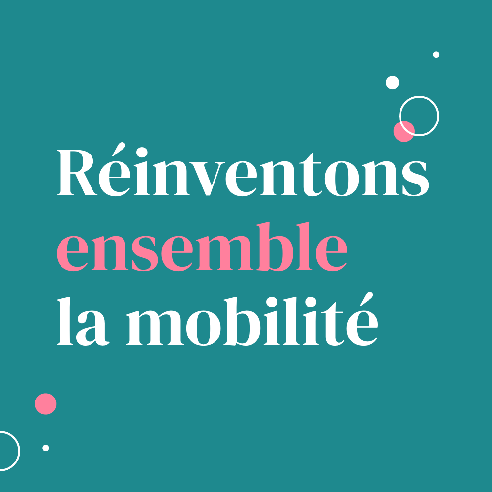
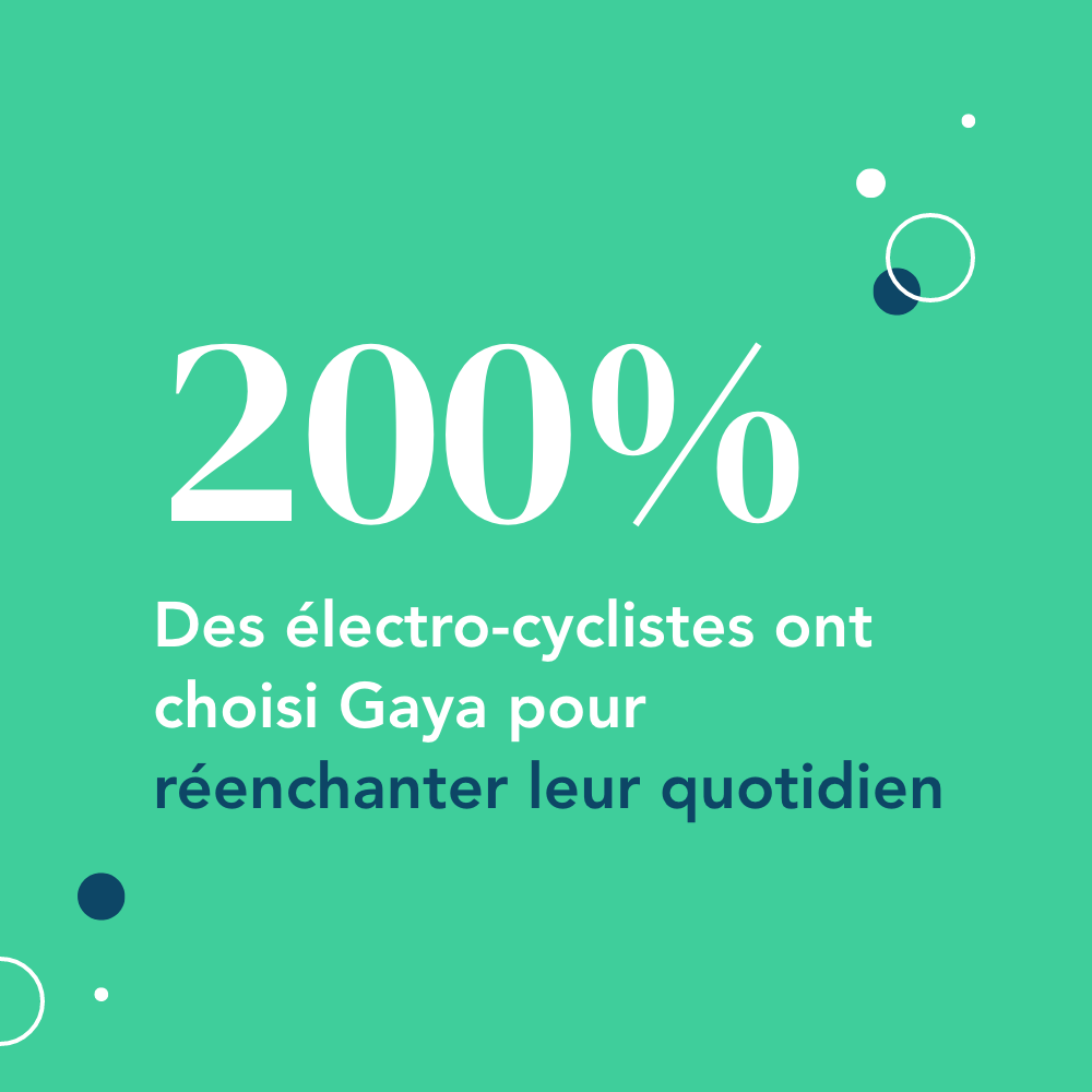
Social
We have created a series of templates for the different social media communication needs. This complete toolbox ensures the autonomy of the customer as well as the continuity and the respect of the graphic charter.


Brandbook
To conclude this workshop, we provided the team with a Brandbook serving as a guide to the use of the charter and its applications, as well as to the use of the different screens of the digital experience.