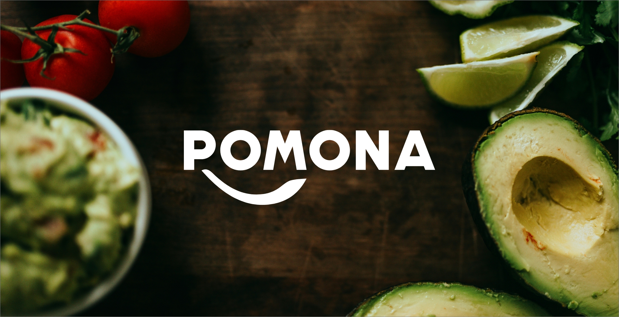
POMONA
POMONA is the French leader in delivered food distribution for foodservice professionals. In a highly competitive market, the group needed to make its activities easier to understand and better reflect how its areas of expertise complement one another. To address this challenge, POMONA called on Fllow to completely rethink its brand identity from the ground up.
Branding Sprint
3-day co-creative sprint to design and create POMONA's new logo.
Creative Support
Update and adaptation of the graphic charter across the Group.
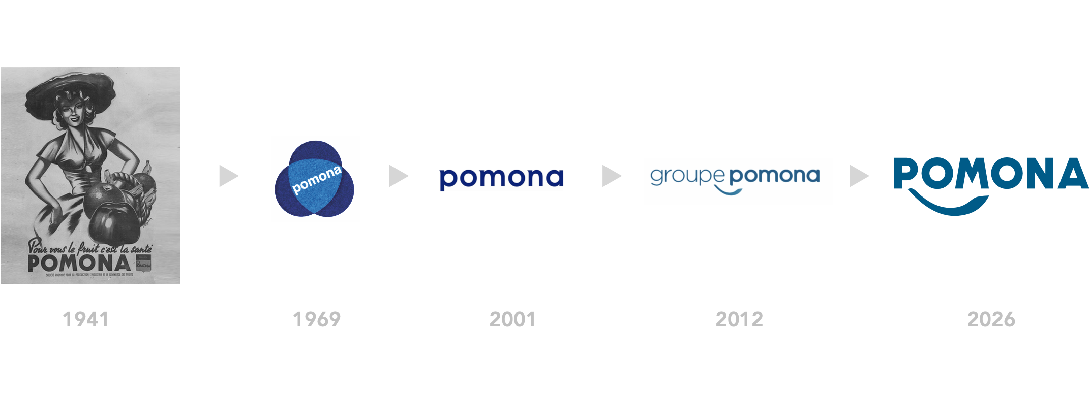
Group Logo
The rebranding of Groupe POMONA's identity aimed to visually express the strength and solidity of a major player in its ecosystem. A historic company founded in 1912 in Reims, POMONA has continuously transformed itself to keep pace with the evolutions of its market. This capacity for adaptation and innovation makes it today an essential benchmark in professional food distribution. We built on this historical depth to redefine its identity. Drawing from its graphic heritage, we redrew the logo's typography to express a more assertive stature, in line with its leadership in food distribution for professionals.
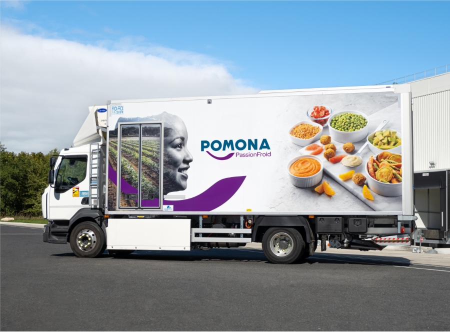
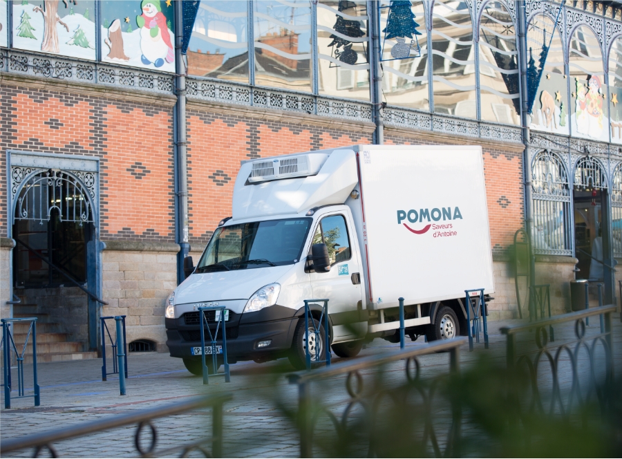
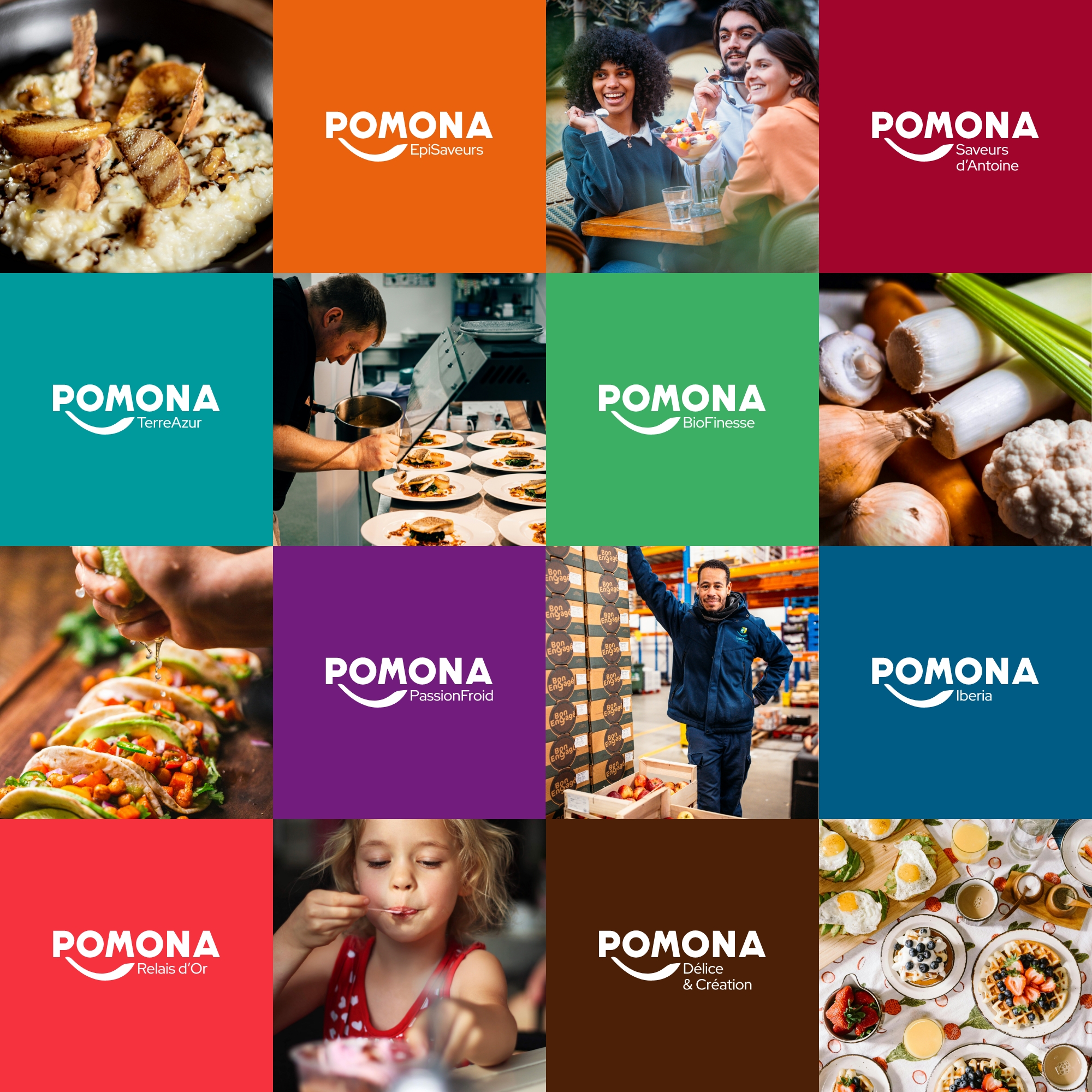
Branch Logos
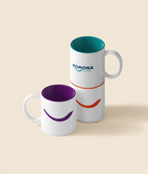
Building on this rebranding, the visual identities of the Group's various branches were also revisited. The goal: to create a cohesive system capable of unifying the Group's activities while respecting their individual specificities. Each entity now exists within a shared visual territory, strengthening the overall readability of the POMONA brand and the perception of a structured, clear and powerful group.
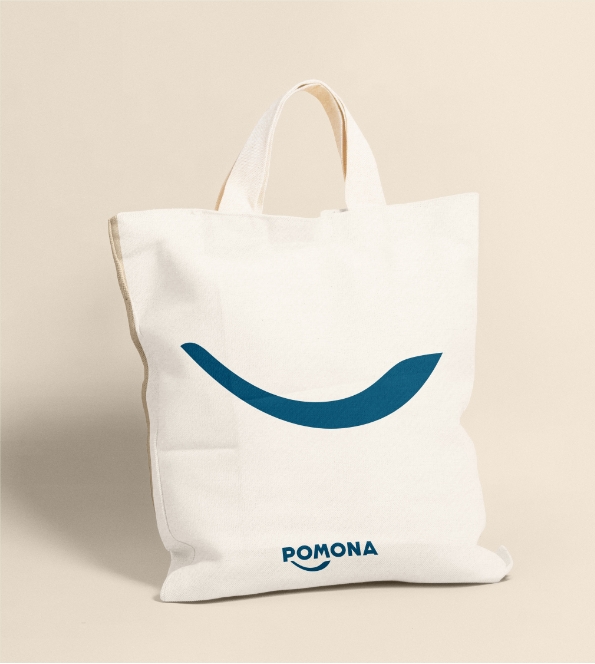
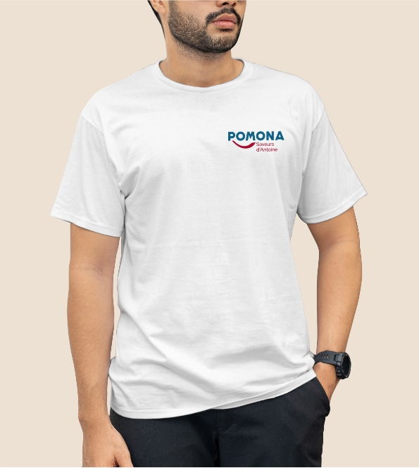
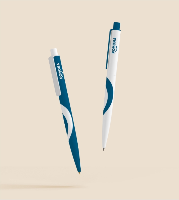
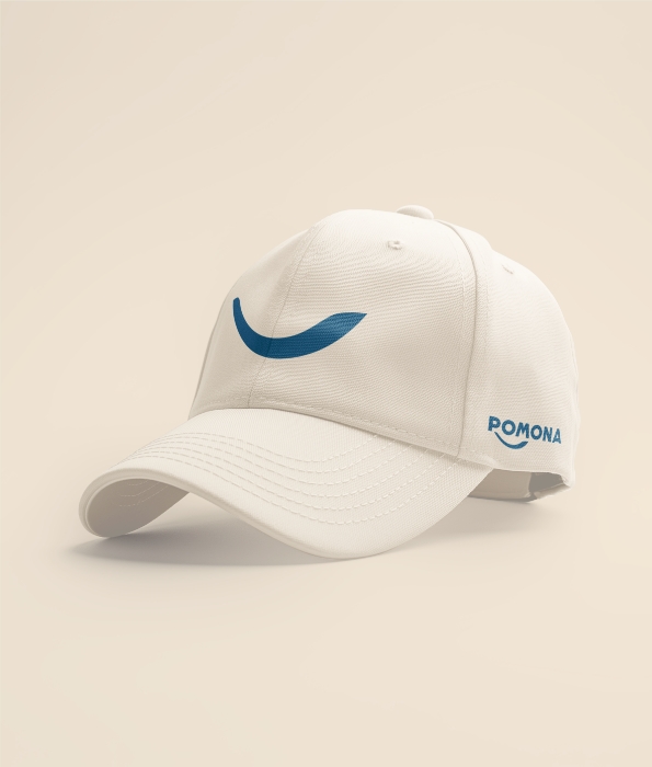
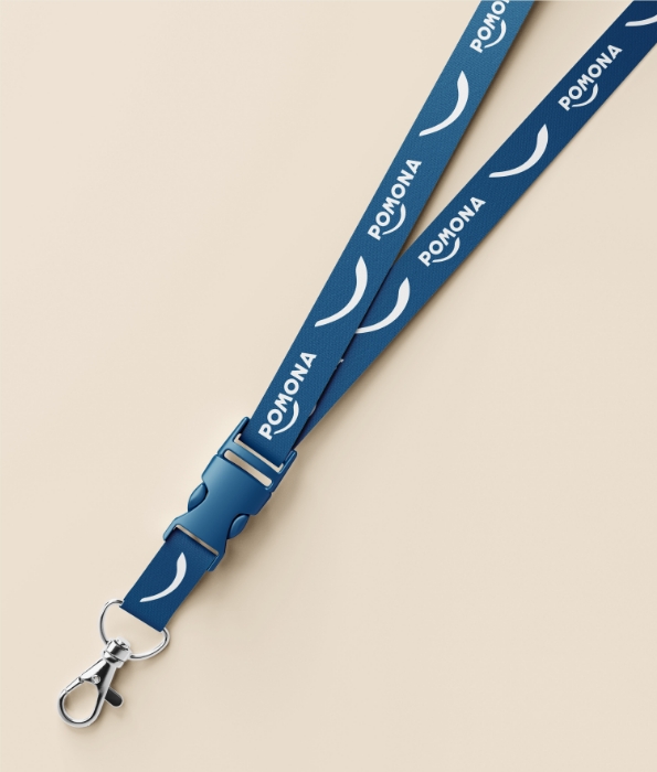
Brand Applications