La Bloomery
In one week, in collaboration with a French perfumer, we have re-imagined a brand of perfumes and cosmetics: from the name to the bottle, including the communication and dressing of more than 100 stores in France!
Day 01
Name search and validation
Day 02
Search for logos and graphic universes
Day 03
Logo validation and finalization
Day 04
Illustrations and packaging
Day 05
Display, brandbook and champagne!
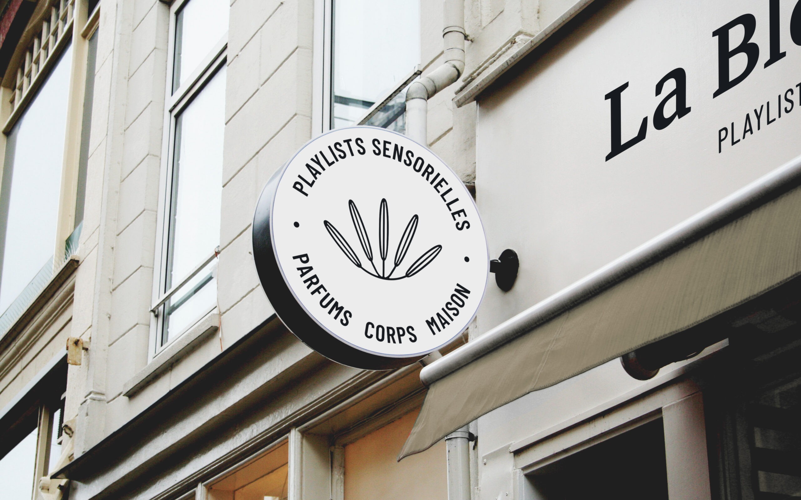
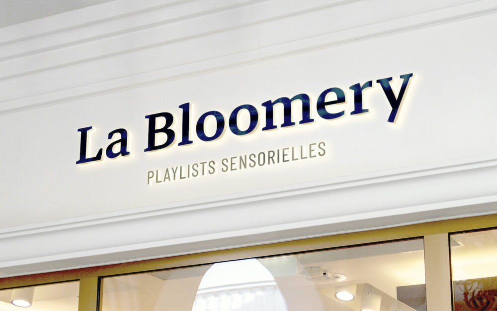
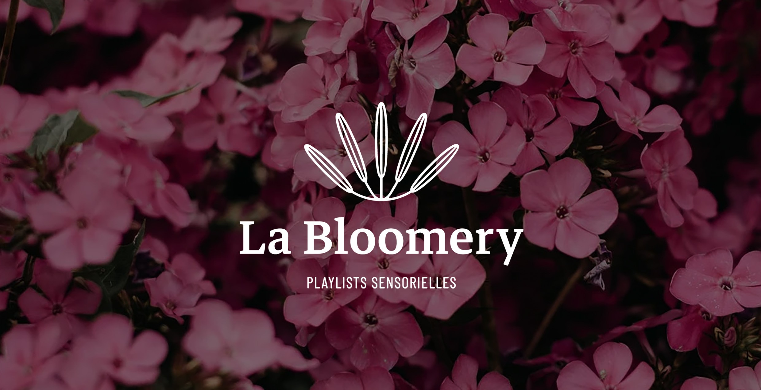
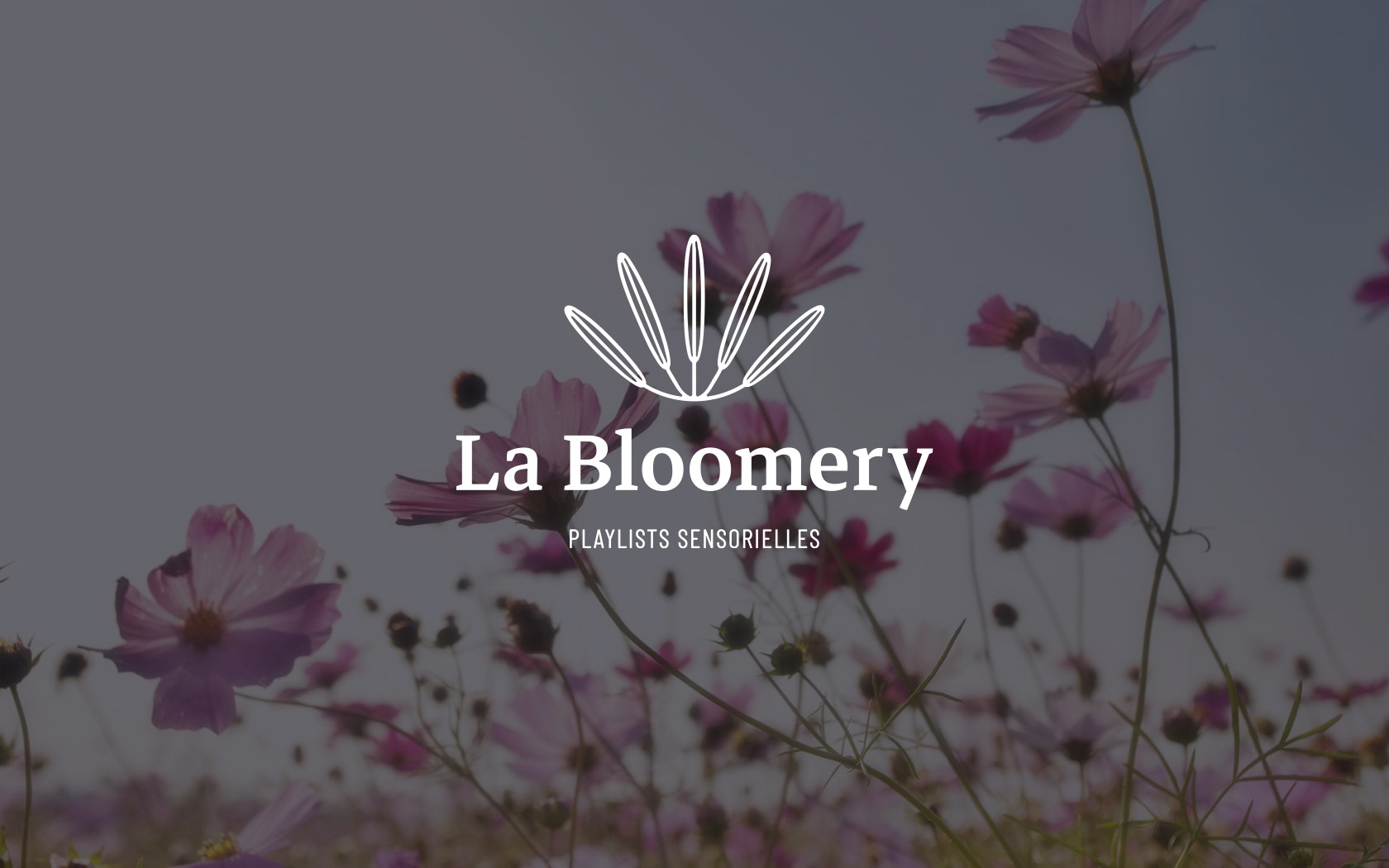
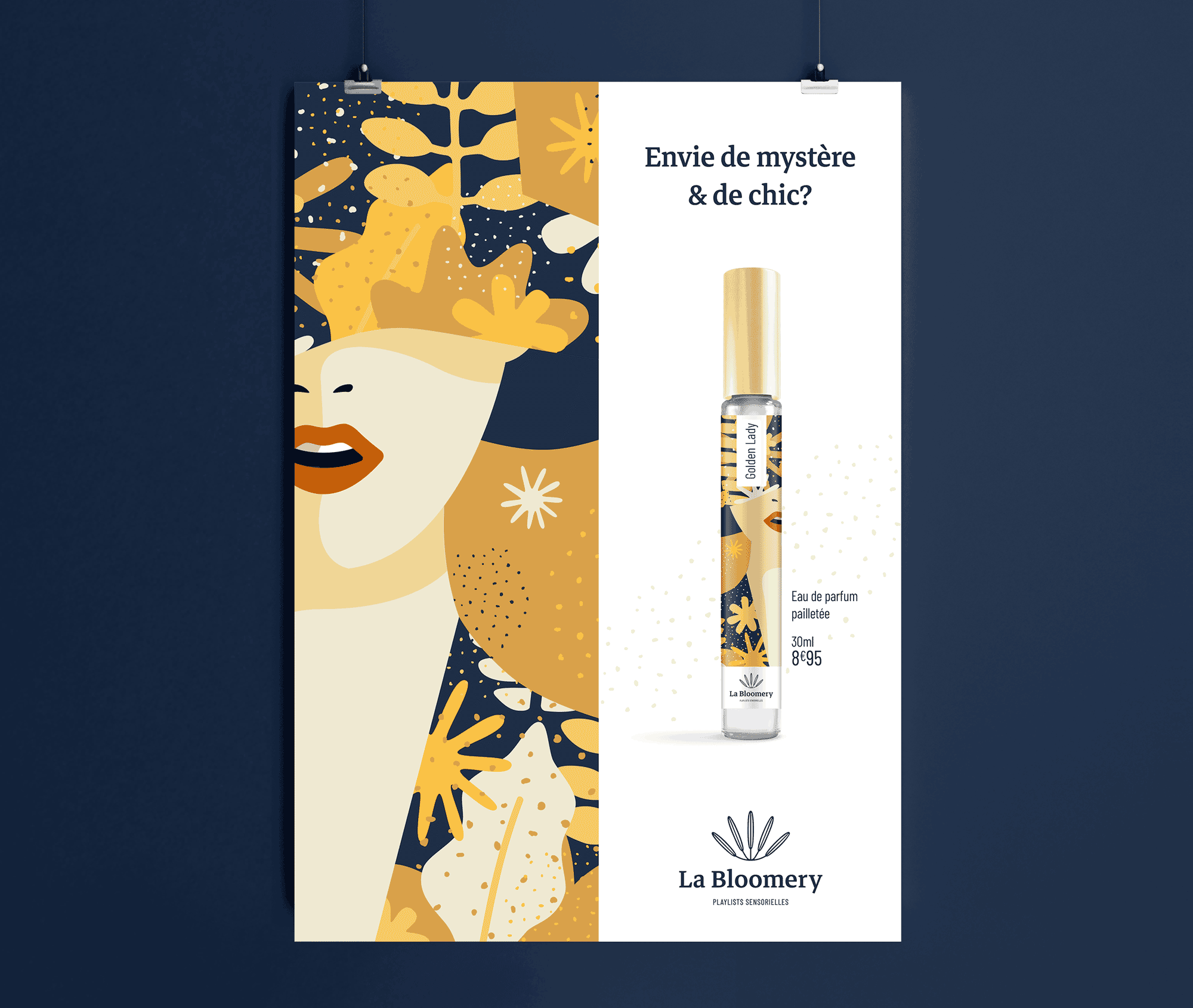
Logo
After imagining the new brand name, we designed and produced a thin, delicate, feminine logo that reflects the values of the brand. The symbol of the open flower embodies the plurality of consumers and the variety of La Bloomery's products, while referring to the world of perfumes thanks to an organic and elegant execution.
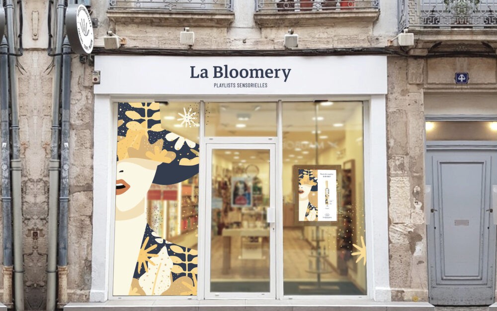
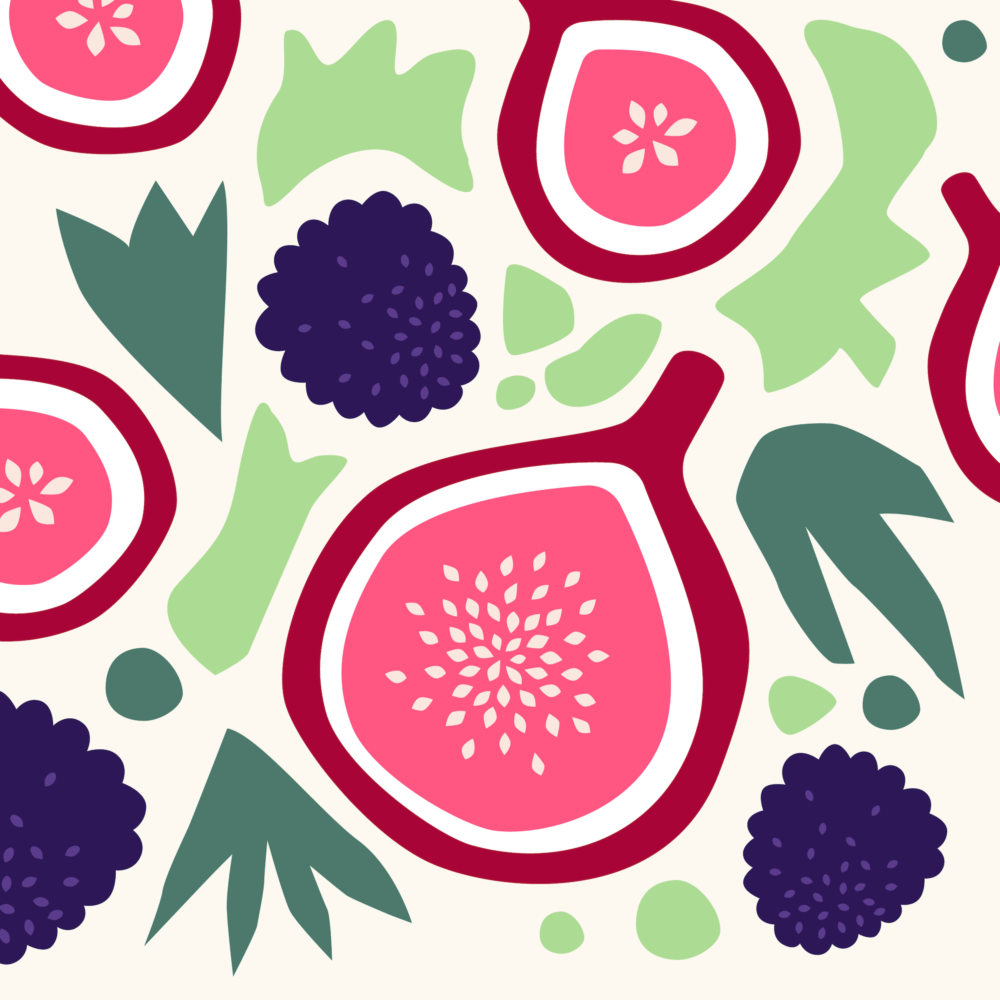
Illustration
We have produced three styles of illustrations for each of the product lines: Premium, Classics, and Essentials. The illustrations express the naturalness, the authenticity of La Bloomery, via a rich universe where each customer will find the product that suits her!


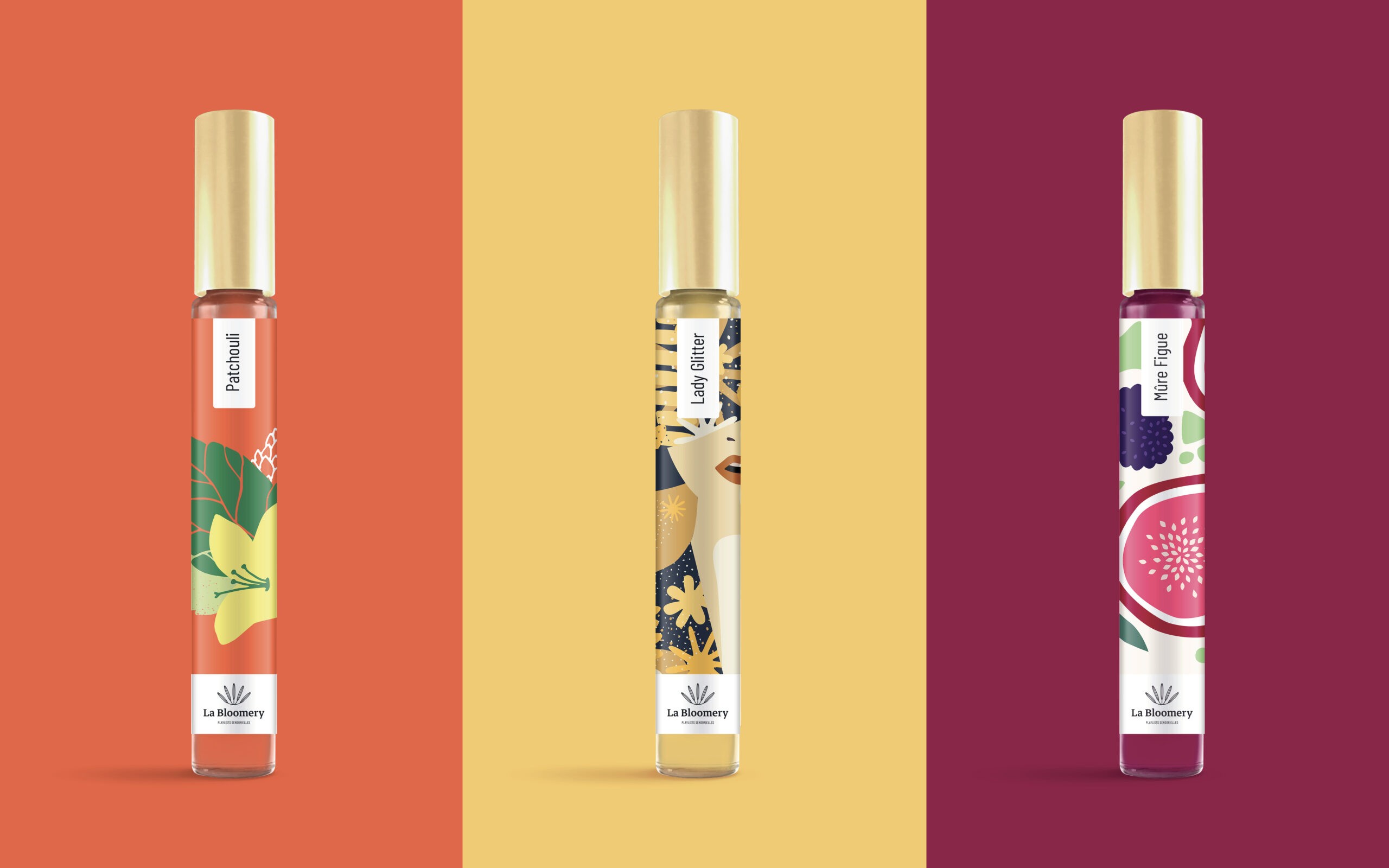
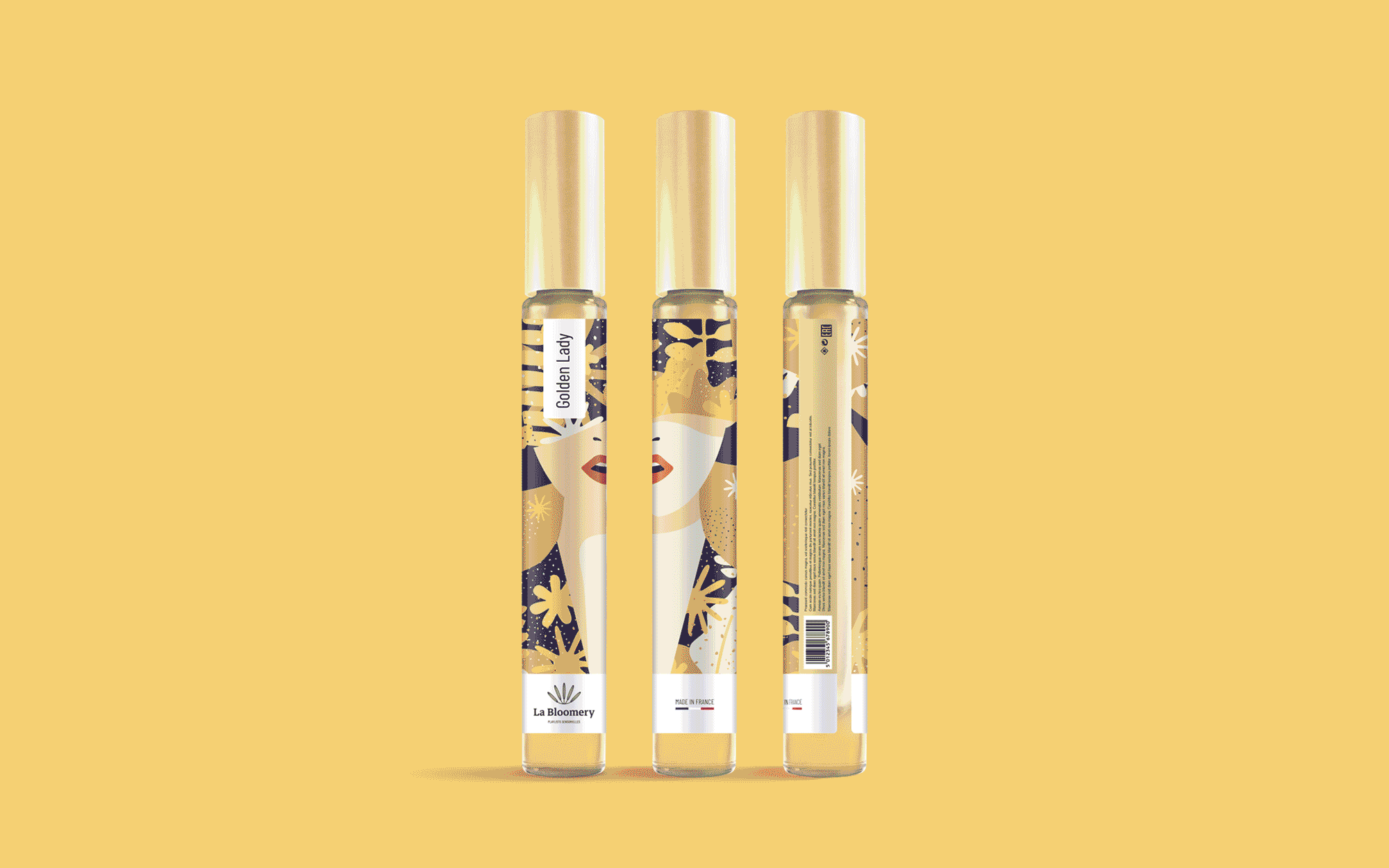
Packaging
Simple packaging, which reflects the quality of La Bloomery products. Illustrations play a major role in the dressing of perfume bottles and contribute to a free, elegant and lively aesthetic.
Posters
The work on the illustrations is also a strong pillar of the layout of the posters designed to promote the brand's products.
Shops