Wemap
Wemap is reinventing the way we experience local information by combining meaningful content and practical services on intelligent maps. Wemap also enables publishers to create and integrate live maps with their own content in just a few minutes.
Day 01
Logo Design
Day 02
App and B2B website User Experience
Day 03 & 04
Graphic design, UI and digital Brand Book
Day 05
Redesign of Investors presentation. Champagne!
Brand Design
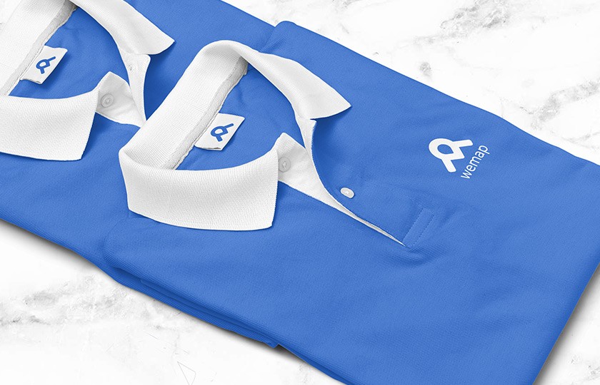
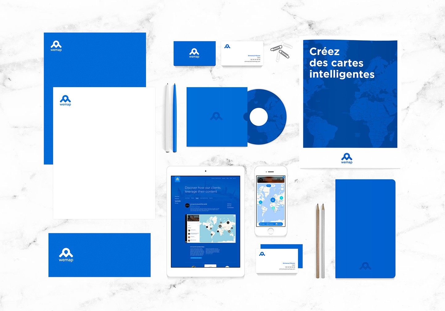
Wemap is a smart and pragmatic solution. To illustrate these two notions, we worked on creating an identity based on a strong symbol. The result was an association of simple and immediately recognizable signs
User Experience & Web design
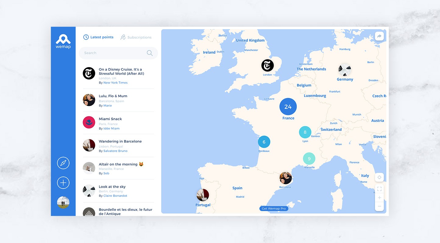
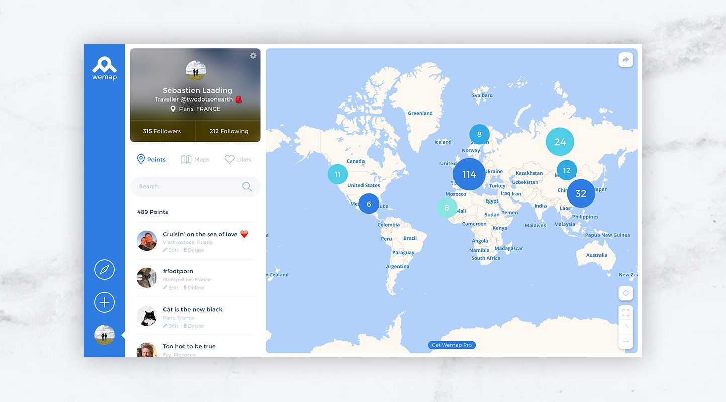
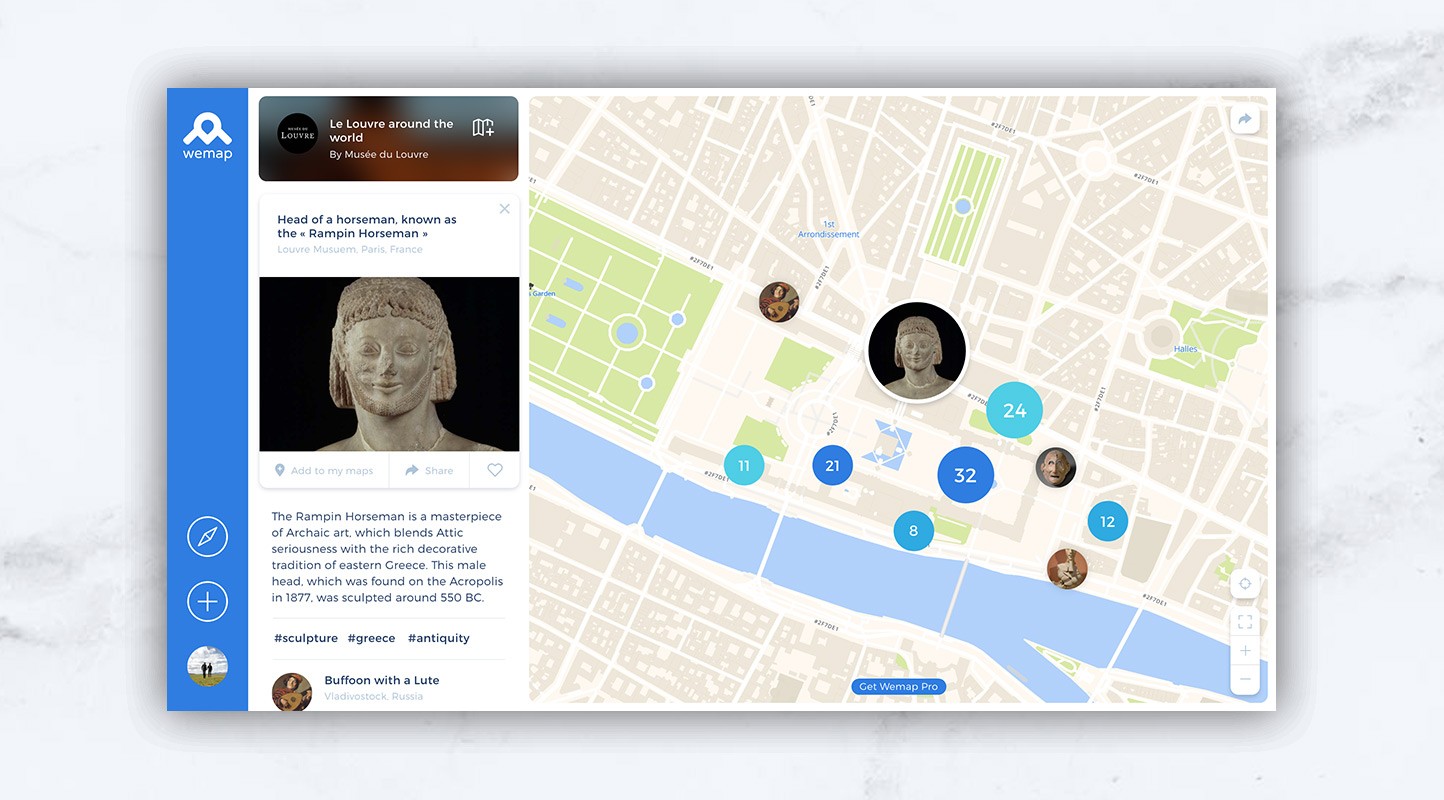
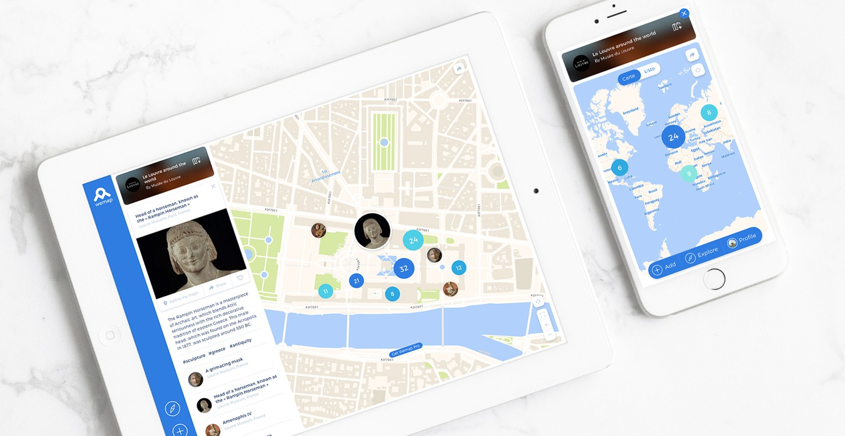
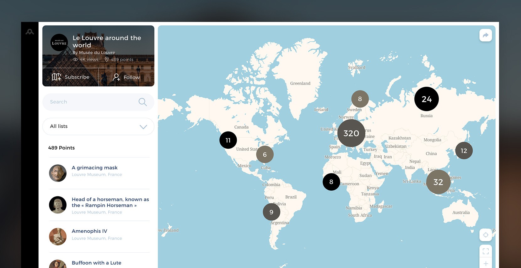
In order to create an enriched use of the map, we have designed a centralized user experience. All actions can only be triggered from it, and all actions have an impact on it. It is the focal point of the experiment which multiplies the uses while simplifying the user journey. For the user, the map is simultaneously a tool and a media!
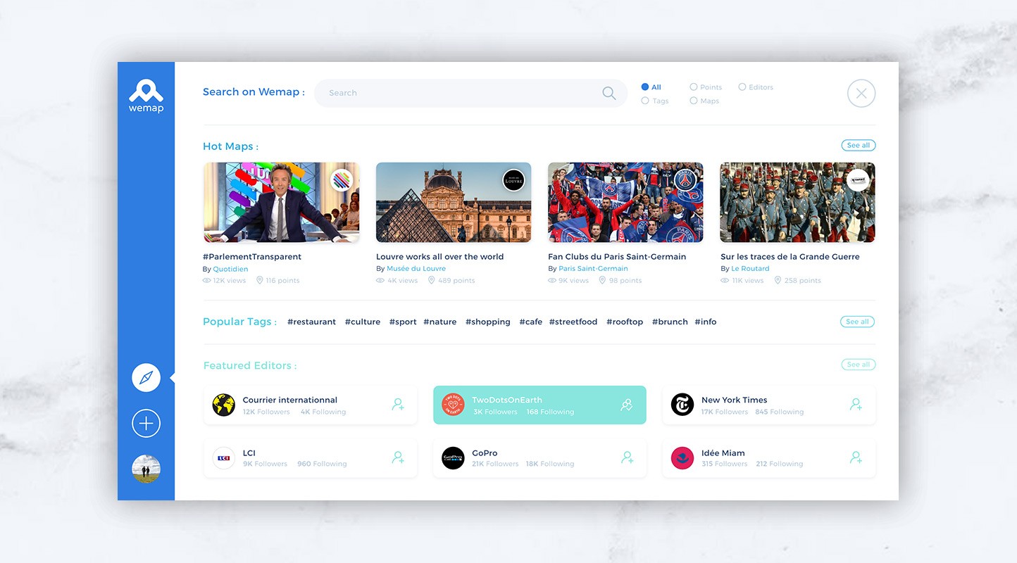
Since Wemap is a platform allowing advertisers to display geolocated content on their own website, the User Interface needed to be strong and iconic for it to be naturally associated with Wemap. Nevertheless, the UI, for its part, had to be flexible enough to allow advertisers to take full ownership of the platform, to harmonize it according to their own Brand.
B2B website
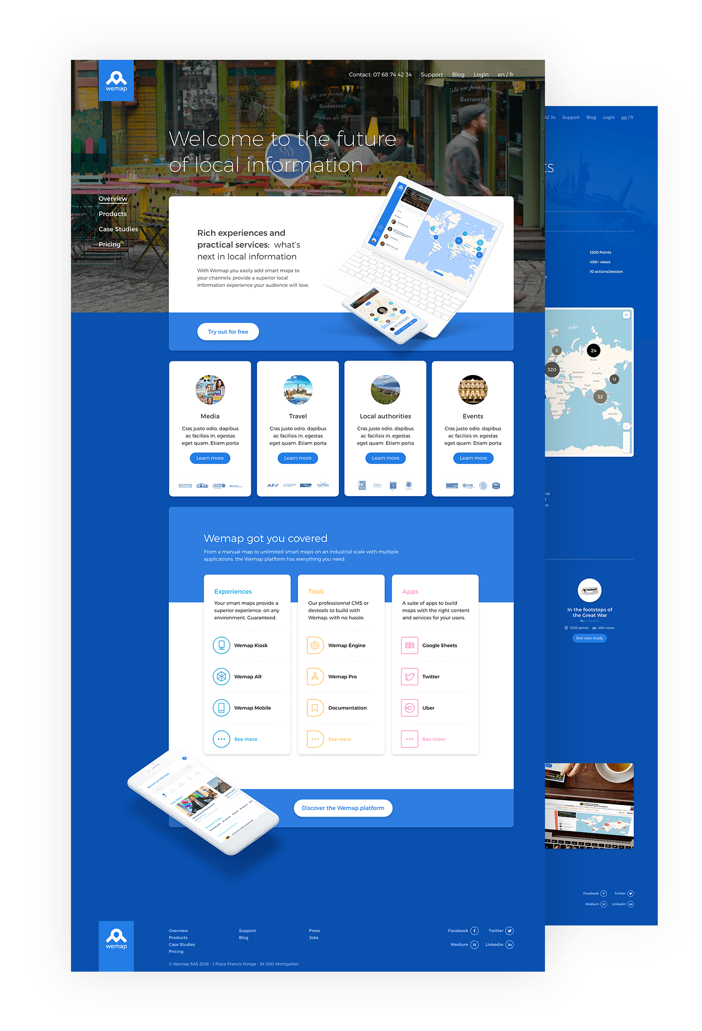
In the logical continuation of the redesign of the application, we have redesigned both the UX and UI of the B2B website in order to make them clearer and add the notions of Platform, Tool and Media back in the heart of the message.
Manifest video
We also conceived a manifest film to embody the role and impact of Wemap in our daily lives.
Investor presentation
Beyond Vision and Data, a fundraising presentation is often the first point of contact with a Brand Proposal, it is important that it reflects your Values and Positioning as much as your product.


